SHARE PEAR
*
SHARE PEAR *
A playful brand and intuitive photo-sharing app designed to make sharing memories effortless.

SECTOR:
Technology / Events
SERVICES:
Brand Identity · UX/UI Design · Wireframing · Digital Design
BRIEF:
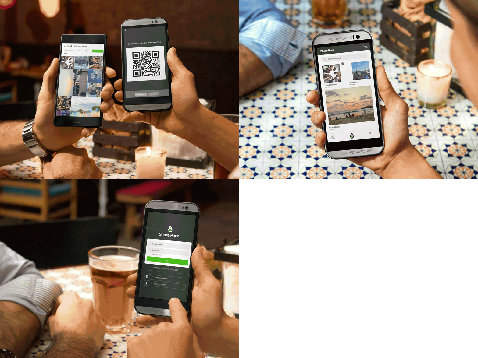
Share Pear began as a concept for a photo-sharing app designed to make it easier for groups to collect and share photos from events, trips and shared experiences. Starting with just the name and an idea, the brief was to create a distinctive brand identity alongside a simple, intuitive experience that made creating, joining and contributing to shared albums effortless.
APPROACH:
Building on the Share Pear name, I developed a playful pear-shaped identity incorporating a camera lens, creating a memorable mark that gives an immediate clue to the app's purpose. From there, I mapped the user journey and created wireframes before developing the UX and UI, working closely with the developer to turn the concept into a cohesive digital experience.

Got an idea that needs bringing to life?
From early-stage concepts to brand identity and digital design, I can help turn an idea into a clear, engaging visual experience.