DEWKES
*
DEWKES *
Evolving an established identity across packaging, products and print for a growing independent dog food brand.

SECTOR:
Food & Drink
SERVICES:
Naming · Brand Identity · Brand Guidelines · Social Media
BRIEF:
Donc is a self-initiated food project born from a love of cooking, local produce and more sustainable ways of eating. The aim was to create an approachable brand that celebrates good food while encouraging small, achievable changes that can have a positive impact on the planet.
APPROACH:
The name Donc comes from the Welsh saying “Dyfal donc a dyr y garreg”, roughly translating to “persistent tapping breaks the stone”. The idea that small, consistent changes can create a much bigger impact became the foundation for the brand, while the short, punchy name gives it a playful personality. From there, I developed a warm and optimistic visual identity designed to make sustainable eating feel inspiring and accessible.
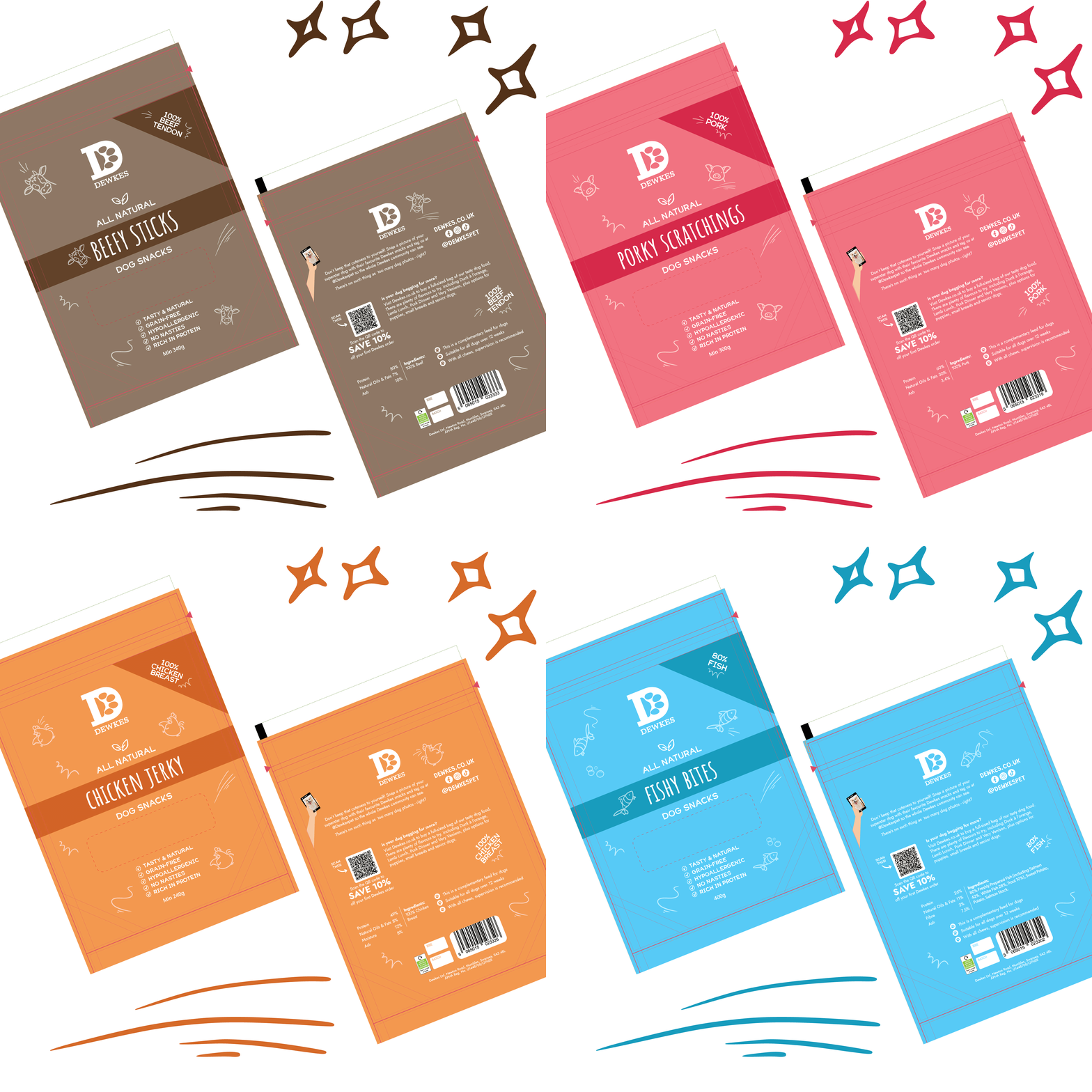
Creating consistency across the range
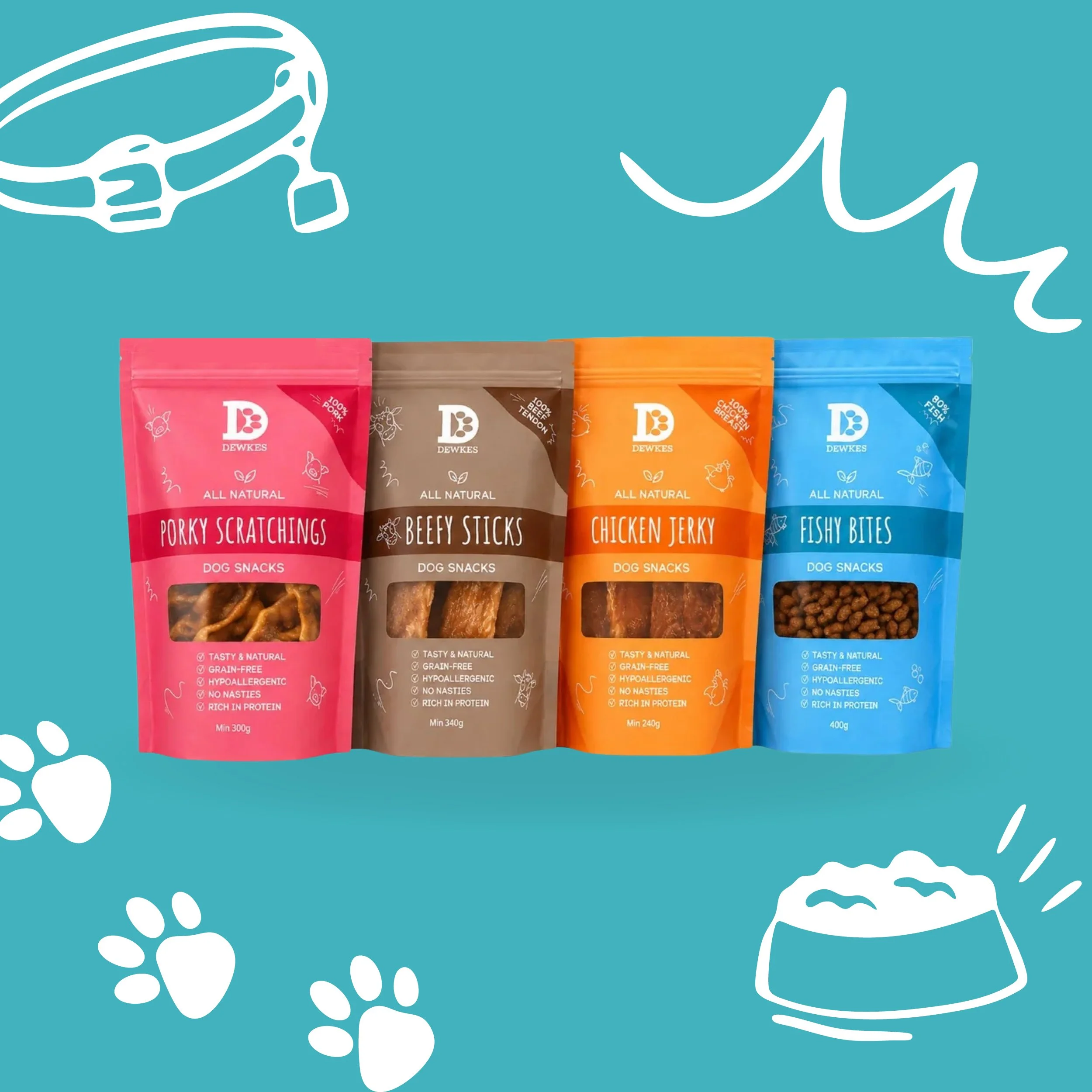
As the Dewkes product range grew, the packaging had evolved across different styles and formats. I refined the existing visual language to create a clearer, more consistent system, while retaining the familiar colours, illustrations and personality already associated with the brand.
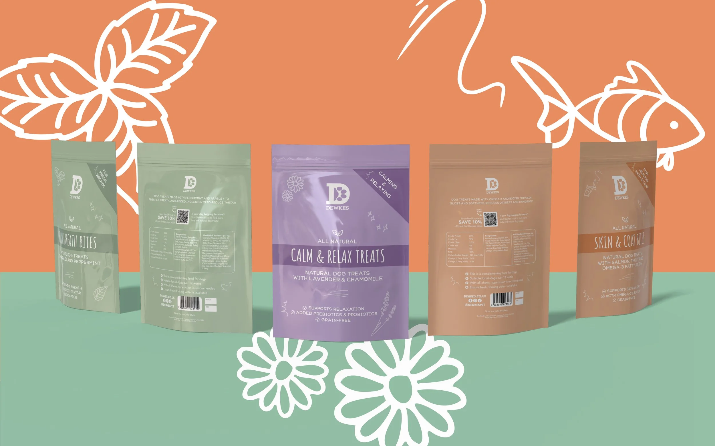
Something new on the menu
For the launch of Dog Fish & Chips, the challenge was to create a completely new product that still felt unmistakably Dewkes. Working within the existing identity, I developed the packaging and supporting graphics to give the product its own character while sitting naturally alongside the wider range.
The established packaging system was also adapted across seasonal products and gifting, allowing Dewkes to introduce something new while keeping the range recognisable and consistent.
Got a product that needs bringing to life?
Whether you’re launching something new or bringing greater consistency to an existing range, I can help turn your brand into packaging and creative that works in the real world.